

22/11/2023
Effective wayfinding signage is crucial within airports to help passengers navigate their journey with ease. When planning signage for airports in the UK, consider the following key tips.

1. Understand Your Users
The first step when designing wayfinding signage is gaining an understanding of who will be using it. Airports serve a highly diverse range of passengers, staff, visitors, and businesses, drawn from countries around the world, so consider differences in language, culture, physical ability, digital literacy, and familiarity with the airport environment – i.e., accessibility – when designing wayfinding signage.
Signage should be inclusive and accommodate users of all backgrounds, without assuming linguistic and cultural awareness of British norms and symbols. Provide clear pictograms and universally recognised human symbols for individuals with language barriers or visual impairments, and position signs at heights accessible to wheelchair users. Design for simplicity and intuitiveness to aid infrequent flyers. By considering user needs upfront, you can create signage that caters to all.
2. Use Clear And Concise Messaging
The messaging on signs should be unambiguous, straightforward, and concise. Avoid lengthy passages of text that overload users with too much information at once, and where possible use simple language that is easy for all to comprehend quickly.
Convey only the absolutely essential information like gate numbers, terminal names, directions to key locations, etc. Omit any non-vital text that could cause confusion and streamline your messaging to be direct and focused for maximum legibility while in motion.
3. Establish A Consistent Visual Hierarchy
A consistent visual hierarchy is crucial so users can easily identify the most important information at a glance. In signage design, a consistent visual hierarchy is the structured arrangement and presentation of elements and content in a way that clearly indicates their order of importance. This guides the viewer’s eye to navigate the information efficiently, from the most important to the least and is achieved through the use of varying sizes of fonts, colours, positions, and other visual cues.
Larger, bolder fonts and brighter colours should highlight key destinations such as terminals, gates, and baggage claims, while secondary details like opening hours can appear smaller.
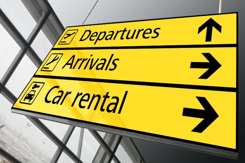
4. Provide Clear Directional Cues
Your airport wayfinding signage should provide unambiguous directional cues to guide passengers seamlessly throughout their airport journey without the risk of misdirection. Arrows, symbols, and consistent colour-coding for different terminals or airlines will indicate the correct pathways.
Signs positioned at decision points can point users in the right direction, and you can also use digital signage and on-screen maps at key areas to further augment your physical signs. The aim is to proactively help passengers navigate to their desired destination without confusion.
Elevate Passenger Journeys Through Thoughtful Signage Design
At Image Techniques, our signage design expertise can help develop wayfinding solutions tailored to your airport. Contact us today to learn more or request a quote.

Image source: Canva